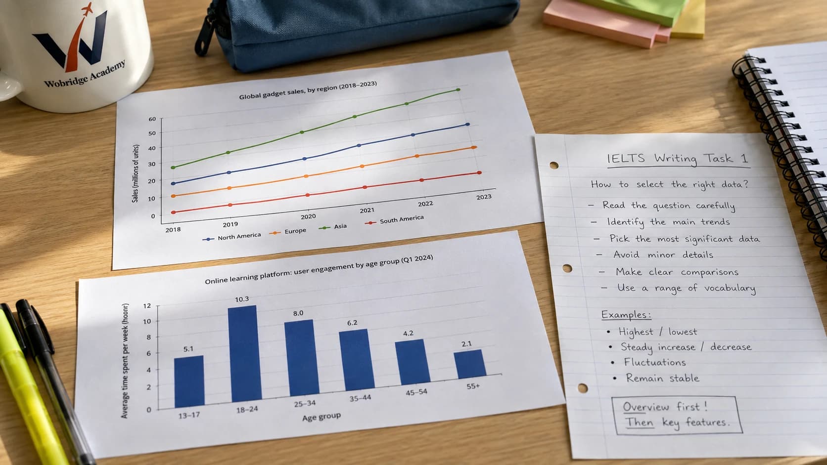
Task 1 gives you a chart and twenty minutes. The strongest temptation is to describe each line, each bar and each year in turn — the fastest way to run out of time without having said anything.
This article is about the step that comes BEFORE writing: choosing the figures.
Four kinds of feature worth mentioning
Almost any chart answers the four questions below, and those answers are the set of figures you need.
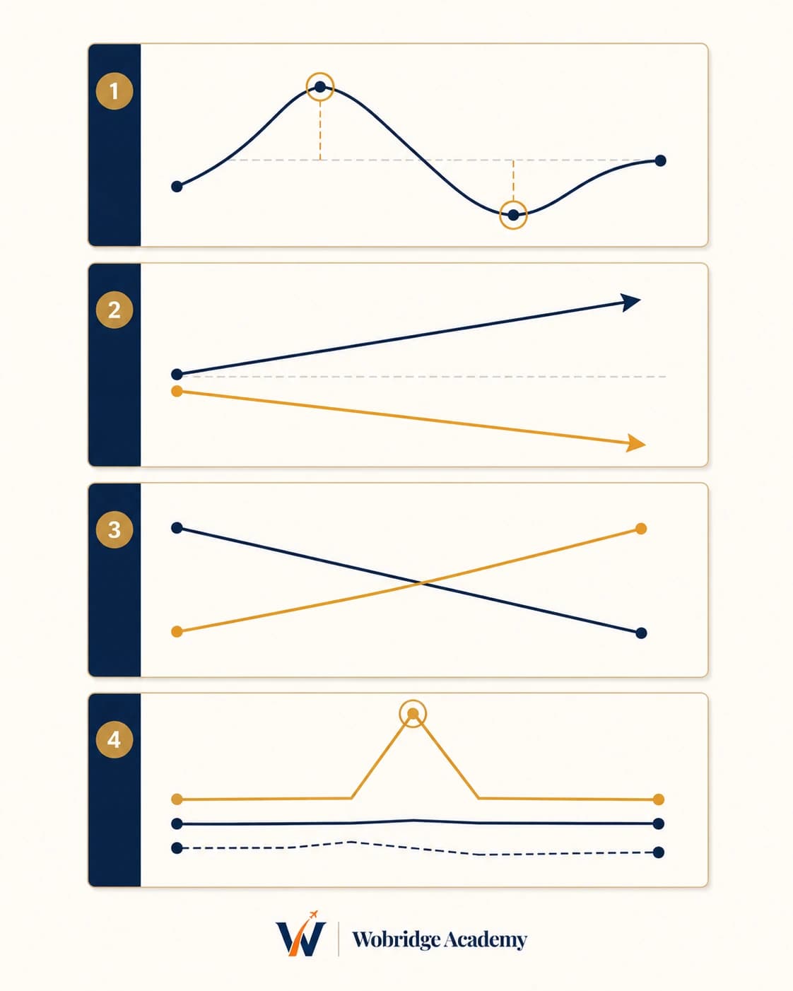
Four questions before writing
Which is highest and which is lowest, and when?
Is the overall movement upward, downward or flat?
Is there a reversal, a crossing point or a sudden jump?
Is the gap between groups widening or narrowing?
Put figures inside sentences, never on their own
A number without a comparison says nothing. “In 2010 it reached 45%” is data; “in 2010 it reached 45%, nearly double the other group” is an observation.
So each sentence should carry a relationship: higher, lower, twice as much, up by so many percentage points. The figure is there to prove the relationship, not to fill space.
| Instead of | Write |
|---|---|
| A is 45%, B is 25% | A is nearly double B (45% against 25%) |
| 2000: 10, 2010: 30 | The figure tripled over the decade, from 10 to 30 |
| C fell to 12% | C fell furthest of the four groups, down to 12% |
The opening and the overview
The opening is one sentence restating the prompt in your own words. Straight after it comes the overview — two or three sentences giving the big picture, with NO figures.
The overview carries more weight than almost anything else and is the part most often skipped: it shows you read the meaning of the chart rather than just its axes.
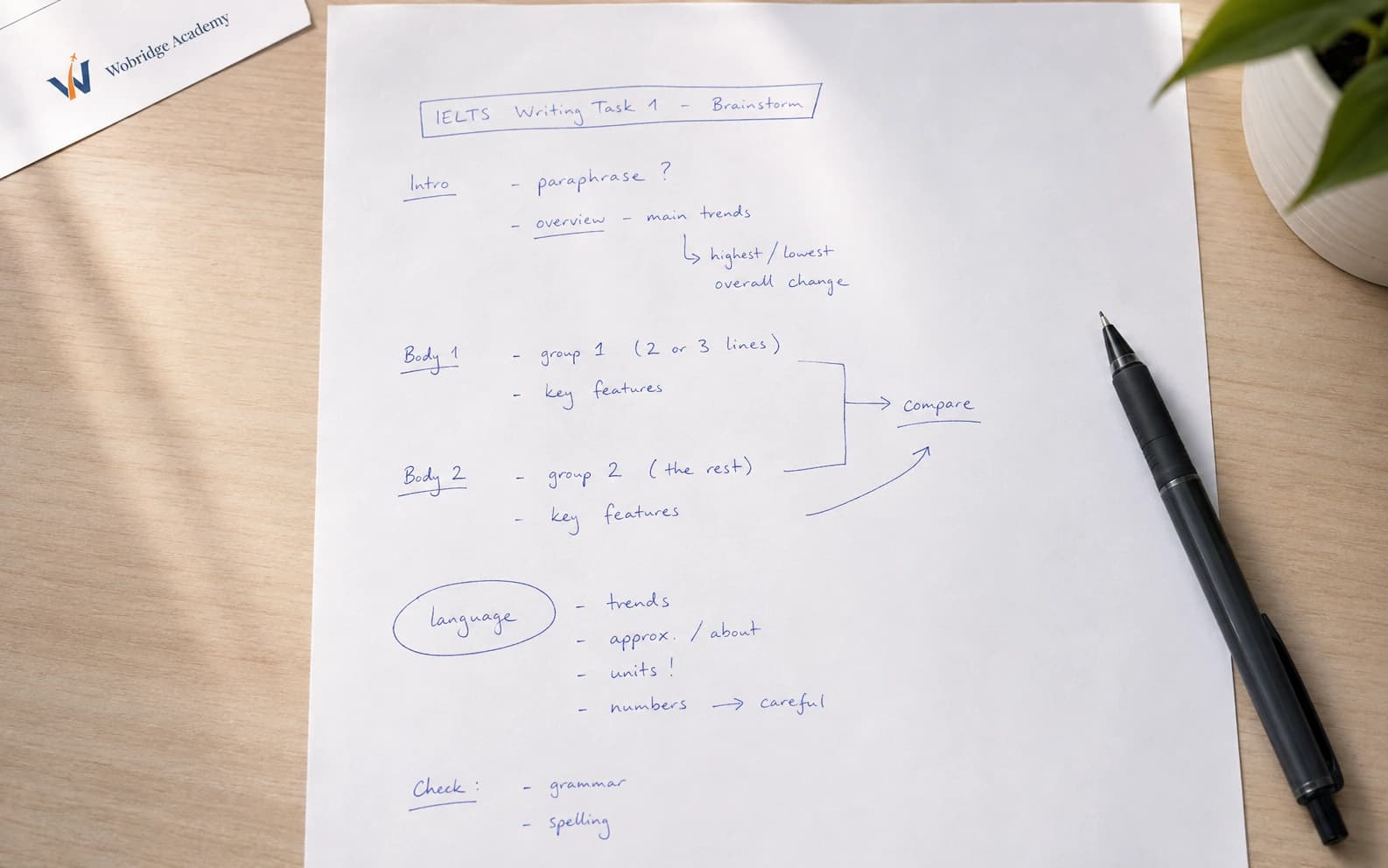
The twenty minutes divide well like this: two reading and circling, three drafting four points, thirteen writing, two checking. Skipping the drafting step skips the one that decides the band.
The figures and rules in this article come from the test provider's published materials. Check the latest announcement before you register.
Topics
- Writing
- Practice